From touch screens of various sizes, to Microsoft Kinect™, Google Glass, Fitbit, and Square, we’re seeing a panoply of new devices that broaden both what technology can do and how we interact with it. This explosion of new interaction technologies has even created a bit of a hiring frenzy for interaction, user experience designers, and human computer interaction specialists whose job it is to design how exactly we are going to get all these new toys to do what they are supposed to. Dreaming up fantastic new ways to interact with all this fancy technology is one thing, but how do those dreams become applications, and how do people know how to use them once they get them?
Part of the answer, as always, is documentation. If a designer can’t explain exactly what it is he has in mind to a developer in a clear and consistent way, chances are the application or device won’t behave quite like it was intended. And if users can’t figure out what they’re supposed to do to accomplish some task, they’ll probably just give up and tell their friends not to buy whatever it is they had problems with.
There’s no single solution for documenting complex sets of interactions, but there are a few methods that are emerging as standard practice for both internal and user-facing documentation in these cases, along with a few pitfalls that designers, developers, and technical writers need to be aware of.
Several attempts have been made to standardize the illustration of touch screen gestures. Some are more abstract than others; however, none of them make much sense without the labels, and they all leave quite a few of the specifics of an interaction open to question, or worse, interpretation.

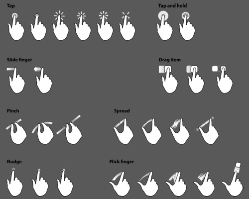
For example, how does a developer know how far across the screen a swipe should go before it triggers the corresponding function? How long does a touch and hold last? How much bigger does an image get for every pixel worth of pinching a user does? And these are just the tip of the iceberg. Recently, this patent application made the rounds online depicting a method for creating a game-like experience while watching commercials:
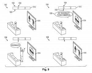
I’ll leave the cringing to you. Moving from the ridiculous to the sublime, let’s continue with the documentation discussion. What’s the important part of this interaction? Why does the viewer stand up? Is it because of some technological limitation where he isn’t recognized by the system if he is sitting down? Or did the designer just draw it that way? Developers need to know the answers to all of these kinds of questions in order to make the holistic experience of these new devices consistent, effective, and pleasing to users.
For the user, understanding how to interact with a new device and its capabilities can be just as complicated. Freehand gestures, like those seen in the film Minority Report, are gaining popularity with the release of devices like Microsoft Kinect and the Leap Motion controller. But freehand gestures can be particularly hard to recognize, even with sophisticated technology, which means a user has to be sufficiently accurate when performing the gesture.
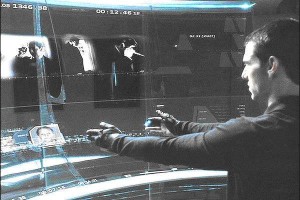
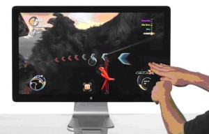
When any possible set of hand movements can be made to be meaningful, how do we communicate to users which parts of the movements are the important parts? Some designers and futurists will quickly say that we shouldn’t have to, but that’s not going to cut it if changing channels on the TV has someone flapping his arms like a bird, trying to get the TV to understand, when the TV is looking for some particular thumb angle. Can you see the difference between Tom Cruise’s rigid arm, hand, and finger positions in minority report and the seemingly arbitrary positions from the Leap Motion concept video in the example?
There’s no single answer to this issue yet but one thing is clear: documentation is as important, if not more so, than ever, and the level of specificity, both about the functions of a system as well as how it is controlled, is increasing. Chances are, good documentation for these kinds of applications will take advantage of many different mediums, and will draw from many different fields, including industrial and interaction design, computer science, and electrical engineering to create a coherent suite of documents that will be referenced and shared by all the stakeholders of a particular application or device. Developers will need to watch videos, interact with prototypes, and look at Photoshop files while still referencing more traditional forms, like wireframes and requirements specs, in order to bring designers’ visions to life. Designers will need to produce interactive specifications and prototypes and consider not just the broad interactions and their meanings, but also the specifics of those interactions with relation to the capabilities of current technology. And both designers and developers will have to work together to create user-facing documentation that is built into systems and that appears transparent to the user. These can be onerous burdens to already overworked teams, and having someone on the team dedicated to documentation – someone who can bridge the gap between design, development, and users – can ensure that the future doesn’t fall on its face right out of the gate.
