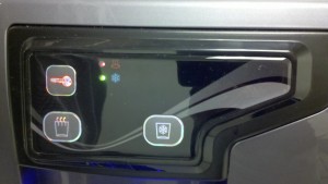
There is an unfortunate trend towards using more images and icons and using fewer written instructions (I like to say “words”). Personally, I don’t think it’s obvious what every icon actually is and what it means, especially when I’m in a hurry to do something.
Here’s an example: A few weeks ago in the office I was trying to get hot water from a water cooler (seems wrong, doesn’t it?) and it took me a couple of tries to figure it out! A few days later, I noticed one of my coworkers standing in front of the machine equally confused about how to get hot water. I showed him how to do it and he was happy. I was relieved that it wasn’t blatantly obvious, that I wasn’t the only one who couldn’t figure it out.
Here is a photo of the water cooler:

To me, the cold water isn’t hard to figure out. But for hot water, it’s not as obvious. I need a label or two to push me in the right direction. Why aren’t there any helpful labels? Do you think the choices are obvious?
How do you think you get hot water?
The answer is in white font to the right of the colon (just highlight the text with your mouse, copy it into an email or Notepad, and change the font color): Press the key icon for about 3 seconds until it beeps. Then press and hold the cup with swirls (“steam”) coming out the top and the hot water comes out.

2 replies on “Reading Images”
Clearly bad design, though I’d argue it’s not the lack of labels that makes it confusing. Think of the water cooler at Shoap World HQ in midtown. No labels. One blue lever and one red lever. It’s completely clear what you’re supposed to do. Take away the key button on the picture and just use pressing the hot or cold button and the design makes a whole lot more sense without needing labels.
I don’t even understand it with the words. But how do you make it international? They should redesign the controls 1st.