Recently I came across this article at the CommLab India blog which presents an interesting opinion on measuring the training effectiveness using the Kirkpatrick model (diagram shown below). The author conjectures that the only practical way to measure this in practice is through Level 2 assessment (i.e., “testing” the student’s retained knowledge). Level 3 and Level 4 (degree of application of concepts and achievement of training objectives, respectively) are unreliable, the writer argues, since these types of measurements don’t exclude external factors, and thus make it difficult to attribute enhanced performance exclusively to training activities.
Author: admin
Recently, one of our clients asked us to document the creating forms feature in Microsoft Word 2007. I’ve used Word 2007 quite a bit with another one of our clients and recently got Word 2010 for my personal computer. It seems a little crazy at first but easy once you get the hang of it.
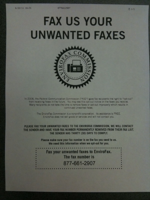
Today we received this notification via unwanted fax:

Is this sort of like text message spam where it tells you to text “STOP” back to the number?
You’ve seen the email version of the inaugural edition of our monthly newsletter. Now see the original pdf.
Buzzwords are just like bad pop stars: they appear mysteriously, gain fans like the plague spreads, and seemingly vanish; yet new ones are constantly appearing. Why do we continuously go through this cycle?
STS has banned buzzwords. I learned quickly that even saying “buzzword” meant trouble—someone would be on a rant soon. So I made a list of the most-abused words with suggested alternatives. I hope I haven’t just created the new lingo.
Choose Your Fonts Wisely
There are certain standard practices in font choice that have become so ingrained that many of us now scarcely consider the alternatives. Writing a paper? Times New Roman. Building a website? Arial. Creating an invitation? Coronet. It seems obvious, almost innate, that printed texts should be written in serif fonts; that digital media should be written in sans serif fonts. But when should these standards practices be broken? When should boundaries be pushed?
Excitement and innovation aren’t really words that come to mind when you think of “technical writing,” right?
I didn’t think so. As interesting as the profession can be, we often find ourselves filling in the same template for the same type of document over and over again. And while it’s important to make clients happy and follow the standard formats, we must always keep sight of our goals – does our documentation serve its purpose? Does it teach? Does it explain? Does it do these things well?
I did not like change.
Last Monday I began a major new chapter: my internship at Shoap Technical Services. I was hired to do marketing for the summer and given a great deal of freedom. I was encouraged to let my mind run free and to tackle any project I thought I would enjoy doing to increase sales. It’s an aspiring PR girl’s dream. But like I said, I didn’t like change.
I recently completed a project to create a document defining the types of functionality and relationships associated with the various database columns and tables in the back-end of a client’s medical billing software. While the project was fun (at least in the sense that I got to work on something nerdy and technical), it was also a sobering reminder about the uncertainty endemic to the world of consulting.
Your employees work for you for a reason. They are good at what they do. What happens when they leave? What information are they taking with them that no one else in the company knows? Will everything run the same after they’re gone?
