Categories
Business Process Writing

Going Agile with Technical Documentation

… we have come to value … working software over comprehensive documentation…

Agile Manifesto

We don’t do a lot of work with practitioners of agile methodologies. I think that’s partly because there’s some built-in hostility towards documentation in the values of agile development. Of course, while the Agile Manifesto is referring mostly to documentation for the front end of the cycle (i.e., the giant FRS), that hostility ends up spilling over to end-user documentation as well. (I don’t think that was the intention.)

Categories
Business Visual Aids

Clients, Please Choose: Good, Fast, or Cheap?

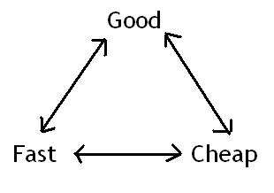
goodfastcheap

Clients often want everything, but the simple truth of the matter is that nobody gets everything they want – there is always a tradeoff somewhere, and that can be hard to explain to management types.  This is a struggle that every hired gun will have to deal with eventually, but it CAN be done!

I recently came across an intersting post at Future Perfect which explains the concept very simply using Rhys Newman’s handy graphical representation of the triangular relationship between fast, good, and cheap.  Just remember, the closer you get to one of these, the further you are from the other two.

This is defnitely something you’ll want to keep in your toolbelt when pitching projects to clients.

Happy estimating!

Categories
Humor? Language Writing

Think That Abbreviation Through

As a technical writer, I feel communicating well is the primary focus of my job. Perhaps this is why I found the following email exchange particularly comical today:

Email from <name deleted to protect the innocent … or not so innocent>:

Categories
Business Process Writing

Making New Programs Easier: A Case Approach

It is often difficult to know what the priorities are when creating a successful new program. As a project manager for Shoap Technical Services, I have a fair amount of experience initiating new projects. Over the years, I have developed a few key “rules” for every project. While I could just go through my list and explain why I think each rule is important, I think it is easiest to learn through experience, so I have illustrated them through a case study of a recent project.

Categories
Captivate

More Buttons!

Recently, I was working on a new Captivate project when I noticed that one of my go-to buttons did not show up in the drop-down menu with button styles.  Most of the projects where I used that particular style were created in Captivate v.2, so I assumed that the button styles were unique to that version of the application.

Wrong.

Categories
Captivate

Captivate -ing Discoveries

error1.jpgIf you’ve just started using Captivate, the best advice I can give is the kind that should be printed in big, friendly letters on the front of every technology-related reference guide or manual… DON’T PANIC.  While there are a million and one reasons to use our favorite demo/presentation/simulation software, there are a few issues that you are inevitably going to have to deal with.  In the past I’ve written about consistent, reproducible errors that I’ve had to work around, but once in a while I run into something entirely new and unpredictable.
error2.jpg

After recording a demo today, I went back into the project to edit the auto-generated captions.  I checked the “Apply To All” options and then changed the caption style from Adobe Blue to Haloblue.  The default text size for both caption styles is 12 pts, but when I clicked OK, it changed all caption text to the Haloblue style… at 16 pts.

I undid the change, re-tried it on the same caption, and saw the same behavior.  After closing and re-opening Captivate, I could no longer replicate the issue.

So don’t panic.  Always reboot first.

Categories
Useful Links

Typeface Detectives Do It For You

I don’t have time to write yet another long post complaining about Captivate today, so I figured I would tell you about some useful font-matching tools that I’ve come across lately:

wtf21.JPG

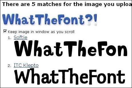
  • What The Font? (above) – upload a sample image containing the text that you wish to analyze, and then confirm the characters shown in the image when prompted.  A few seconds later, WTF spits out a list possible fonts.  It was successful in identifying the font used for its own logo, so it is at least functional, but more extensive testing is needed – still, it is a useful tool to keep in your bookmark file.

fontthing1.JPG

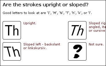
  • Identifont (above) – similar to What The Font, Identifont will ask you around 15 questions about a font you are looking at and then take a guess as to what it is.  Didn’t have much luck with this one (got confused with Times New Roman) but then again I was only using a few letters.  I also can’t rule out user error since some of the questions were worded in such a way that they confused me.  I guess that’s what I get for being an “ESL” kid…

Hopefully these tools will make font-matching a little bit easier next time you need to do something like that.  Enjoy!

Categories
Captivate

Careful With That Captivate Update!

Howdy folks! Hope all has been well since our last exciting installment in our ongoing Captivate entomology series.

Since my last post back in May, I’ve had the mixed experience of upgrading to the latest version of my *favorite* software package in the world. I would be ready to give our faithful readers a full run-down of the new features and enhancements in v.3, if it weren’t for the fact that I’ve been tied up troubleshooting what I considered to be a show-stopping issue with the new version: an apparent inability to capture full-motion recordings.

Categories
Captivate

Bride Of The Captivate Bug

Don’t have much time to spend on this post today but I thought I would put something up regarding some Captivate bugs that I’ve experienced recently, and how I’ve worked either with them or around them:

Click boxes that can’t do simple math

Captivate click boxes give you the ability to specify an action to perform when a user clicks outside of the box a certain number of times. While building a quiz-type activity, I thought this would be a good way to invoke an error message whenever the student clicked on not-the-right-answer enough times (I set it to 2 times). The error message would then take the student back to the start of the activity to try again. Well, it worked, except that after getting a wrong answer on the first slide and cycling back through to the same slide, the click box reacted to clicking on not-the-right-answer a single time (instead of twice, like I specified in the click box’s properties). I haven’t figured out how to work around this – if you did, tell me about it in the comments!

Categories
Useful Links

Tiny USB Office Makes You a Word-Processing Ninja

As a technical documentation expert, I pride myself on being able to get the most out of the simple tools that usually sit unused in most people’s Start menus. Why go through the trouble of setting up SnagIt just to capture a simple screenshot, when Alt + Print Screen and MS Paint will accomplish the same job at no additional cost?