Categories
Blogroll Business Captivate Flare Humor? Language Process Rants ROI Tools Training Uncategorized Water Cooler Stuff Writing

Why User-Centered Design Matters

When was the last time you used an application that was just impossible to comprehend?

Shaun Article 1


<!–more–>

Shaun Article 2


Or that you visited a web page that made it hard to find what you were looking for?

Shaun Article 3


I’m guessing you don’t have to rack your brain too hard to come up with an example. In fact, if you’re reading this at work, you might very well have opened our newsletter just to take a break from the confusing enterprise software you’re stuck using for your job.

The Science Behind the Suck

During World War II, Army Air Force scientists noticed that changes in cockpit design often had disastrous effects on pilot performance. When the mental and physical capabilities of pilots did not align with the design of the aircraft, pilots were much more likely to make a mistake. Considering these “human factors” as part of the design turned out to be an important safety and performance issue. This insight led to a new science that linked human psychology to product design.

Fast forward to 1990s. Computer software starts to become mainstream. No longer the realm of the most technical users, human capabilities and product design started to clash again. Building on what the Human Factors researchers had learned, the science of usability engineering took off to meet the challenges of software design.

Some of the important human characteristics that must be considered include:

  • People have limited working memory capacities
  • Attention limits the ability of our minds to process only so many thoughts and inputs at once
  • Our eyes are drawn to salient features
  • We mentally group things in predictable ways
  • Our perceptions are colored by our experience and expectations

So how do you use this knowledge to make digital products that don’t give people fits? I’ll give you a hint: you’ll have to do a little more than add a line that “the application will be designed with usability in mind” to your requirements doc.

User-centered design is an approach to designing and developing software that results in applications and websites that are easier to use and better meet the needs of users.

What Is User-Centered Design

It starts by putting users at the forefront of design decision making. That’s what user-centered design is all about. Through research, observation, iterative design, and usability testing, we can understand the needs and behaviors of our users and use our expertise as designers to craft products which are useful, usable, and pleasurable to the users.

A typical user-centered design process would go something like this:

Shaun Article 4


  1. Analysis – Identify the characteristics of the users, user goals, context of use, and business goals. Talk to actual users and business stakeholders.
  2. Design – Create mockups or lo-fi, low cost prototypes of the solution based on the information gathered in the analysis phase.
  3. Testing – Test your mockups or prototypes with actual users to determine what works and what needs to be improved. Iterate on the design and testing phases to improve the process and move closer to …
  4. Development and Delivery – Building as you iterate through the test and design phase, you’ll approach higher fidelity until you’re ready to complete the development and delivery of your project.
  5. Evaluation and Lifecycle Management – Evaluate the success of the project against the characteristics defined in step 1 by measuring the behavior of actual users. Continue to ensure the product is updated using user-centered principles throughout the lifecycle.

Noticing a theme?

Why Is That So Important?

In the realm of ecommerce, the consultants User Interface Engineering used user testing to discover a usability flaw that was costing a major retailer $300M in lost revenue (http://www.uie.com/articles/three_hund_million_button/). When designing products, Jakob Nielsen estimates that spending 10% of a project’s budget on usability doubles the quality metrics for the project (http://www.nngroup.com/articles/usability-101-introduction-to-usability/).

When designing intranets and enterprise applications for internal use, your users may not have somewhere else to turn. In those cases, you don’t have to worry about losing customers. But poorly designed applications can cause all sorts of problems.

  • Employees are less efficient at their jobs when the tools they need are hard to use.
  • Confusing interfaces may cause employees to make costly errors.
  • Users blame themselves when they have trouble using an application, so having to spend the day using a suite of poorly designed applications leads to unhappy workers and lowered employee morale.

But We Don’t Have Designers! How Can I Get Me Some Of That User-Centered Design?

While you may not have designers, someone does design every application. It may be a business analyst or product manager doing mockups in Visio or it might be the developer turning user stories directly into front-end code. Inadvertent design is still design.

You don’t have to bring in an expensive agency or hire a team of User Experience Designers when you’re just starting out. The best way to improve the user experience of your products is simply to watch your users use your product.

User Interface Engineering has a list of excellent ways to start your user research (http://www.uie.com/articles/starting_user_research/).

Further Reading

If you’re interested in learning more, I suggest starting with the following books:

  • Don’t Make Me Think by Steve Krug – The classic introduction to designing websites and applications for usability. Quick and easy to read, it’s a must read for anybody involved in product work.
  • The Design of Everyday Things by Donald Norman – Norman is a pre-eminent cognitive psychologist and designer. Norman goes more in depth into the psychology of design than Krug, but this book is still quite accessible.
Categories
Blogroll Business Captivate Flare Humor? Language Marketing Networking Rants Uncategorized Water Cooler Stuff Writing

Corporate Speak: Between Sweet Spot and Wheel House

These days, business speak surrounds us. It doesn’t discriminate against company size or position status. College interns and CEOs alike find themselves dropping buzz words in conversation. But to what end? When is enough, enough? The next time you want to move forward, deliver, or buy-in by all means go for it. But don’t expect people to know what you’re talking about. The more time your employees spend guessing the meaning behind your jargon, the less productive they are. Ben Franklin sums it up best:  “Time is money.”

Categories
Business Humor? Networking Training Uncategorized Water Cooler Stuff

Summer Reflections of an Intern

By the time you enter the 3rd grade, you know what summer is. It’s that time of year when you don’t have to go to school or do homework. Instead, you can just play all day with your friends, go on vacations, watch TV, or anything else you’d like to do. Summer is always a time of relaxation, an unwinding from all the busyness and tension of the school year—even at the age of 7. It’s exactly what summer should be—lazy and carefree. Summer break is a break for a reason, right?

Categories
Business Humor? Rants Tools Uncategorized Water Cooler Stuff Writing

Laptop Shopping for the Non-Native Speaker

Take a look at this picture of the keyboard on my Dell Studio 1558 laptop (shown above).  Notice anything odd?

Well, where’s Number Lock?  What happened to the numeric pad (usually shares keys with the 7, 8, 9, U, I, O, J, K, L and M)?  These keys are typically used to type alt code combinations for characters not represented in the English keyboard. A Spanish speaker like yours truly would use them to type the letter “ñ”, accented vowels, and the “upside-down” exclamation and question marks.

The first time I tried to use alt codes with the laptop I thought:  “I must be missing something. They must have come up with some hip new way to do it.”  But how?

It turns out that in their infinite wisdom, computer hardware OEMs have decided to start eliminating features that customers “don’t want” (specifically, the Number Lock and Scroll Lock keys) in order to replace them with things that we just can’t live without, like the Windows key, a disk ejection key, or a right-click menu key. Fortunately, my manufacturer’s support staff offered some ‘helpful’ alternatives like using the Character Map or changing my keyboard language anytime I wish to type a non-standard character.  Alternatively, they offered to return my ability to type accented characters in exchange for a ransom payment of $18.99 for a Targus USB numeric pad.

I still haven’t been able to decide if I’m more frustrated by the removal of a feature that I ‘don’t want,’ the support staff’s absurd ‘solutions’ to the problem that the removal of this feature has created, or the manufacturer’s complete lack of awareness of the message that it sends: “typing in any language other than English on your U.S.-market laptop will not be tolerated.”

So let this be a lesson: if you or your employees value the ability to type special characters quickly (whatever the reason may be), make sure you add the Number Lock Key to your list of features to consider for hardware purchases.  It doesn’t come standard anymore.

Categories
Business Humor? Marketing Uncategorized Useful Links

Score Free Advertising By Thwarting Bandwidth Thieves

This week we had an opportunity to claim some free advertising space in a somewhat non-traditional way, and I’m going to tell you how we did it.

In case you’re not familiar with the term, hotlinking is when a website other than your own uses images that reside on your servers by linking to them directly. Even if you aren’t concerned about protecting the content, this is still a cause for concern since you give up a little bit of your bandwidth (which you paid for) every time the other website loads that image, without getting anything in return. It’s like if your neighbor powered their toaster by running an extension cord to an outlet in your garage – not much impact on your bill if it happens once, but it sure adds up when they do it over and over every single day.  (The general consensus on the Internet is that this is a Bad Thing.)

So, you ask… how do I turn this into the free advertising that you speak of?

Categories
Business Humor? Networking Uncategorized

Will work for…work

As “Intern Emily,” I may be a bit biased, but I think that everyone should be using interns.  Among the plethora of reasons, here are a few I see:

Categories
Humor? Water Cooler Stuff

Irony and Workplace Humor at the Shoap Office

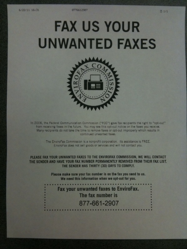
Today we received this notification via unwanted fax:

photo

Is this sort of like text message spam where it tells you to text “STOP” back to the number?

Categories
Business E-mail Humor? Language Writing

A Quick, Easy Way to Save Bandwidth and Not Annoy People

As technical writers, we at Shoap Technical Services feel strongly about words. We feel they hold more power when chosen carefully and used with purpose.  We pride ourselves on only writing as much as needed to accurately convey a message, without allowing room for waste.

That’s why we reserve a very special type of hatred for one of those semi-universal annoyances of modern business culture: the e-mail footer disclaimer.  It should come as no surprise, then, that we took great pleasure in reading this Economist article explaining exactly how pointless these are. It all boils down to the fact that most of these disclaimers are unenforceable since they seek to impose contractual obligations in a unilateral way.

So please, please, save your bandwidth and mine.  Kill the disclaimers.

Categories
Humor? Language Writing

Think That Abbreviation Through

As a technical writer, I feel communicating well is the primary focus of my job. Perhaps this is why I found the following email exchange particularly comical today:

Email from <name deleted to protect the innocent … or not so innocent>:

Categories
Captivate Humor?

Why Instant Messaging and Captivate Don’t Mix

The client that I currently work for requires all employees and contractors to be available on a proprietary instant messaging system at all times during working hours.